Welcome to the "DigitalFog - Art Portfolio". I created this webpage from scratch largely to have a spot on the internet to call my own (using my own domain), and also to brush up on my limited HTML and CSS knowledge. I decided that this might be a nice place to showcase some of the art pieces I have worked on in the past year. I didn't create this page with the intention of showing off to many - so if you are here then, once again, welcome.
Pixel Art - Landscapes and Animation Loops
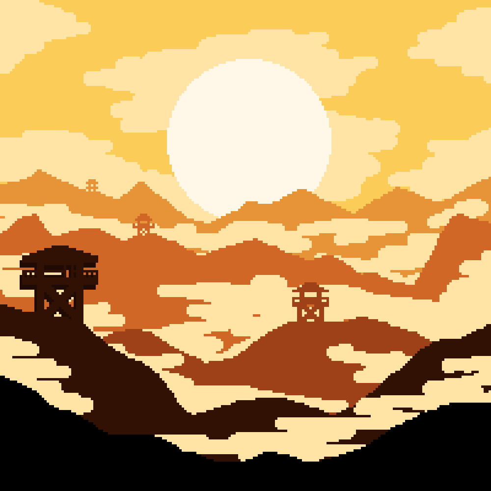
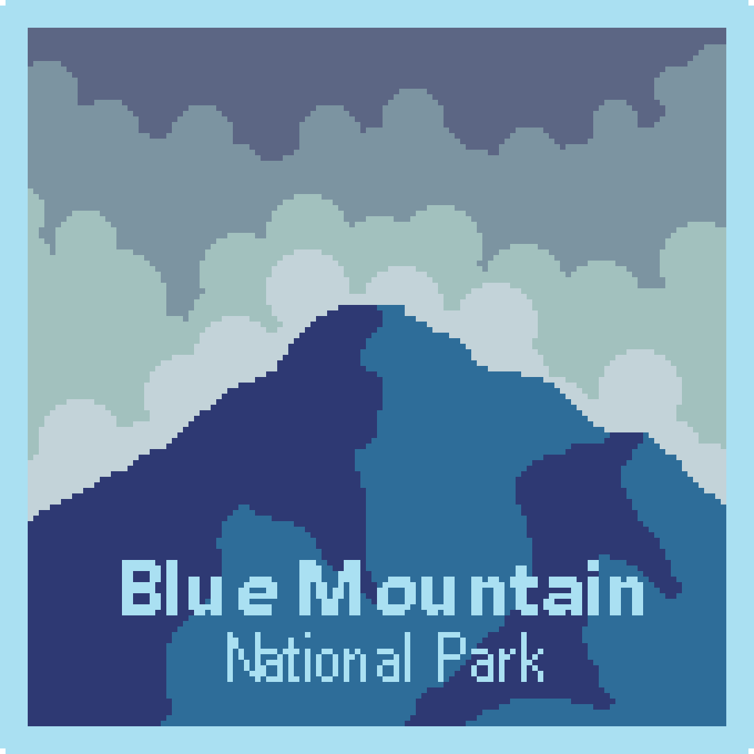
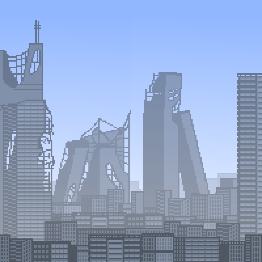
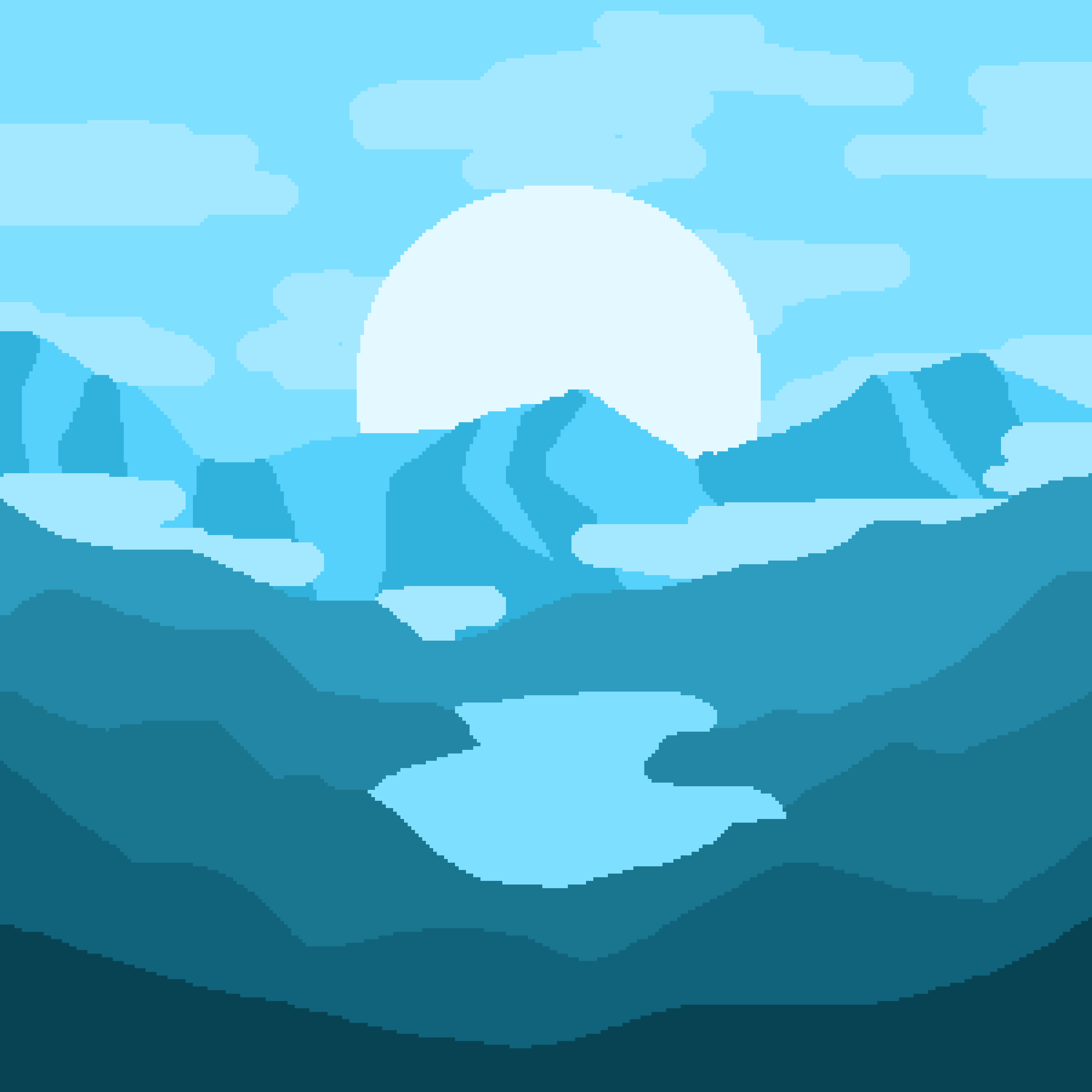
This is a small collection of some of my pixel-art pieces. Landscapes - both in and out of the pixel-art medium - are my favorite genre of artwork.
I find that when making these pieces, a strong color palette can go a long way. That being said, I find I have a hard time with finding a good color palette.
I know when something is off in the color department, but I have a hard time finding what the right colors actually are.
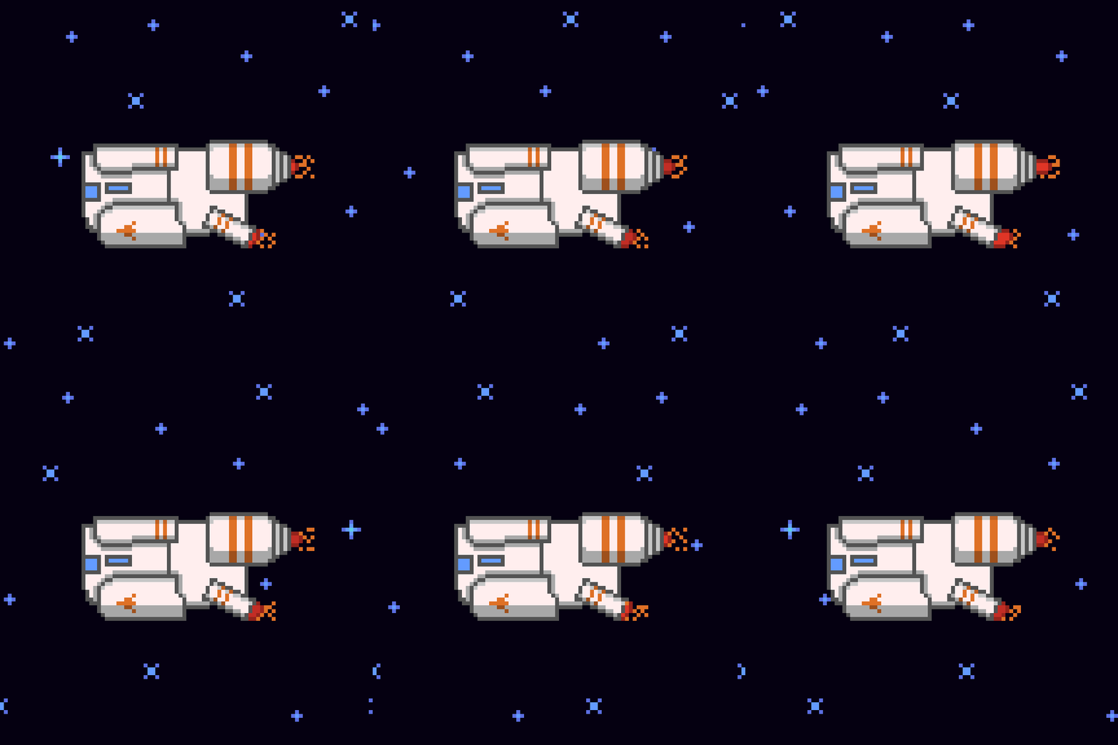
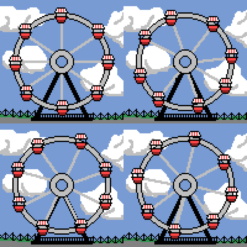
I have also showcased some basic animation loops in the airship and spaceship works.
To achieve the illusion of movement, the background elements like the clouds or the stars are moved every frame until they loop.
This is the basic concept behind a parallax scroll effect but a true parallax scroll would require multiple layers to move at different speeds for the purpose of
simulating depth. In the future I want to try and make a piece which utilizes actual parallax scrolling.


Character Animations
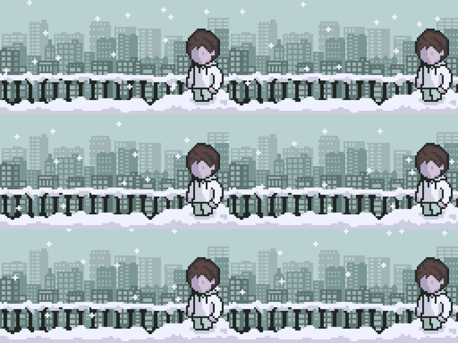
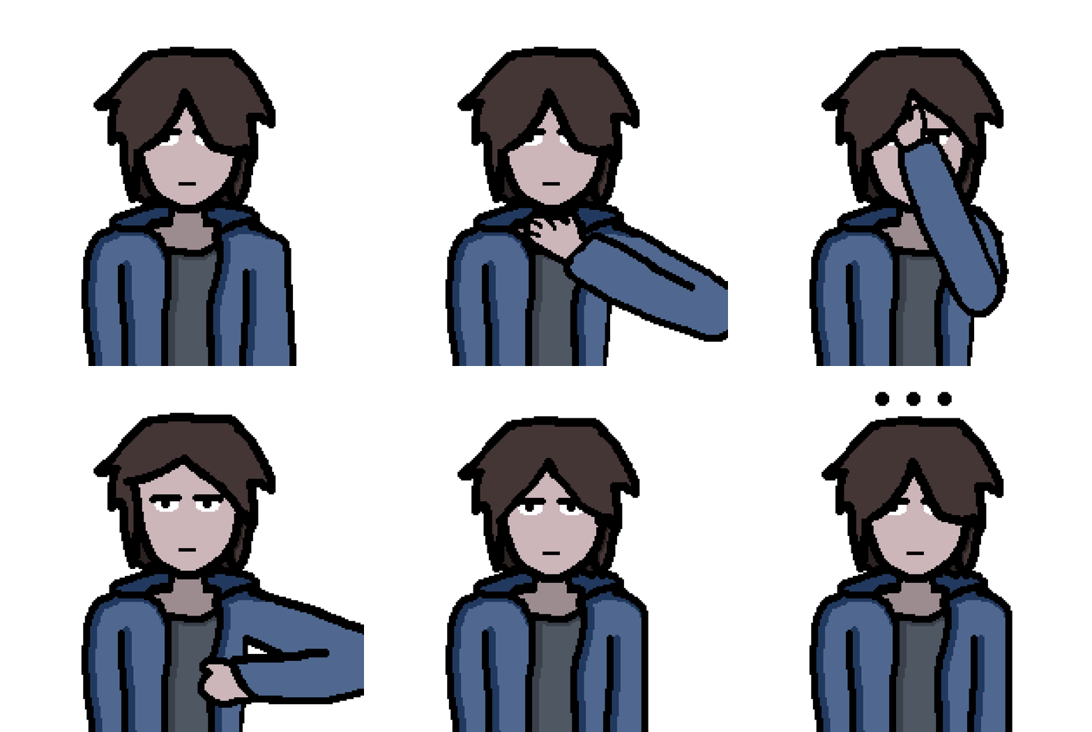
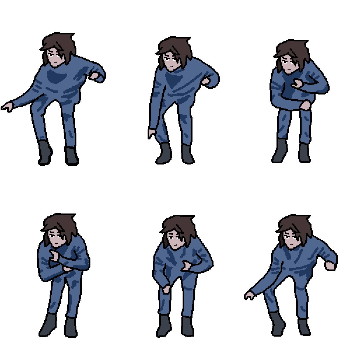
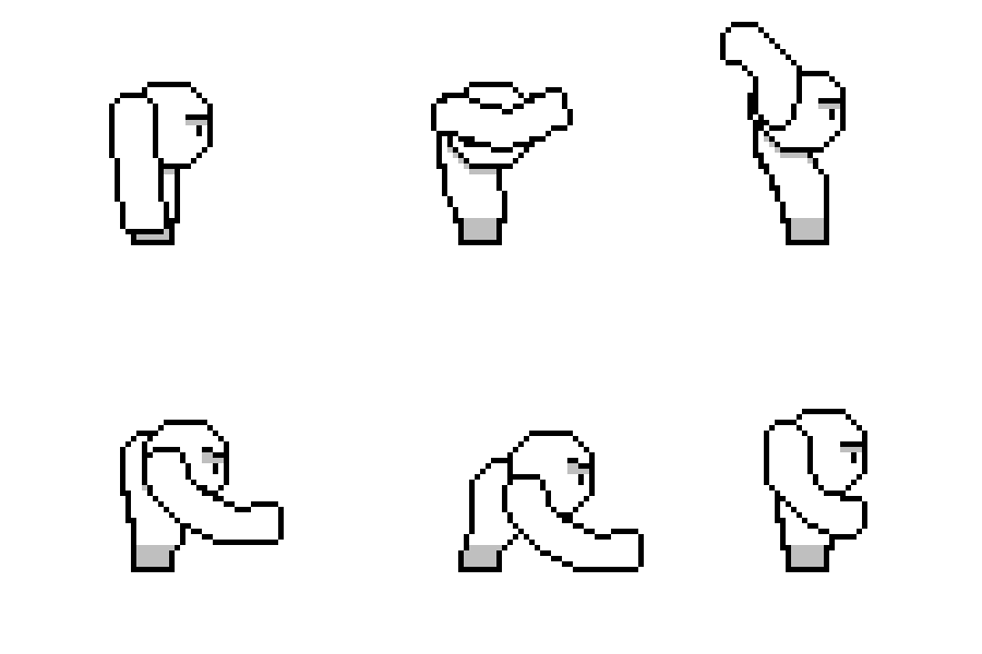
This collection features short animations starring myself (or at least a character based off of me). They don't server a specific purpose but could be thought of as being equivalent to reaction gifs. This collection is by far the most numerous and I contemplated how many I would display here - some are admittedly a bit rough around the edges (as some people like to point out :/) but also showcase how my style solidified. The images displayed here all follow the same general formatting; my character with head and torso visible look directly at the "camera". This format helps me save on time - I can use layers/frames from a previous animation as a starting point for a new animation. This also resulted in a more consistent style. I want to expand my horizons a bit - all the animations in this format are quite simple and don't capture much interesting motion. Animating something as basic sounding as my character running, at the same level of "quality" is much harder.




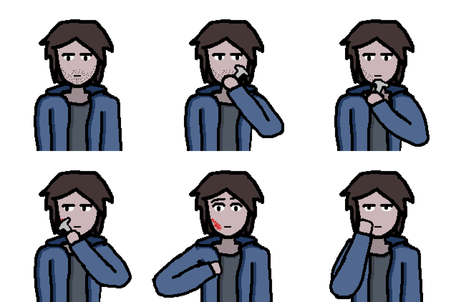


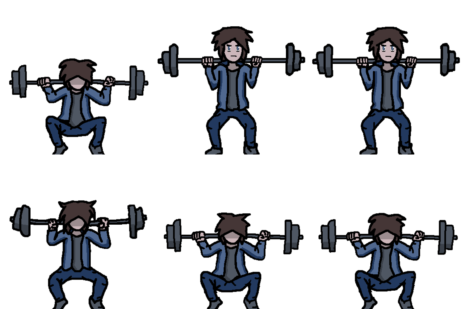

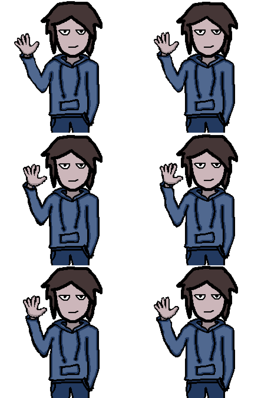
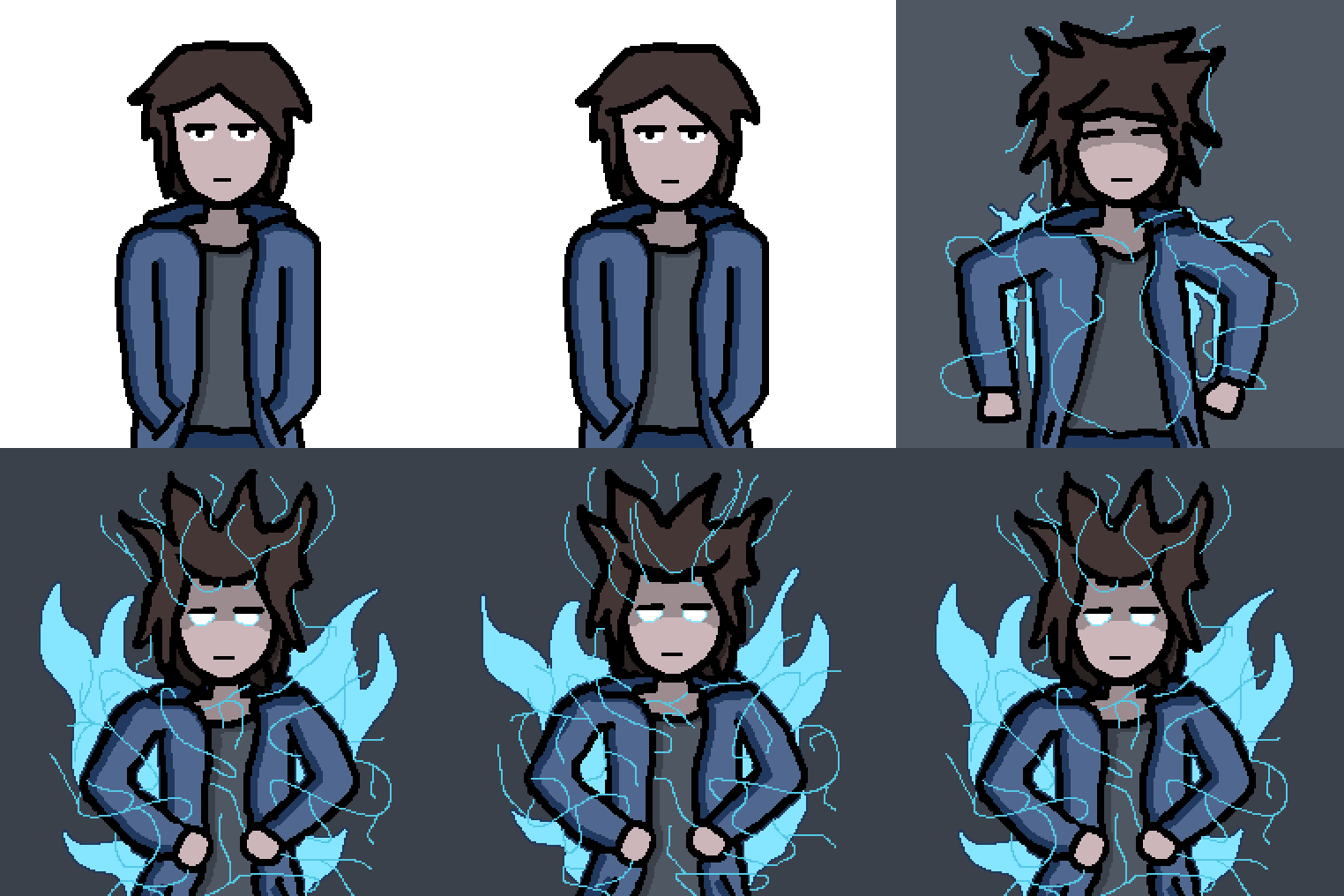



Game Art and Spritesheet Animations
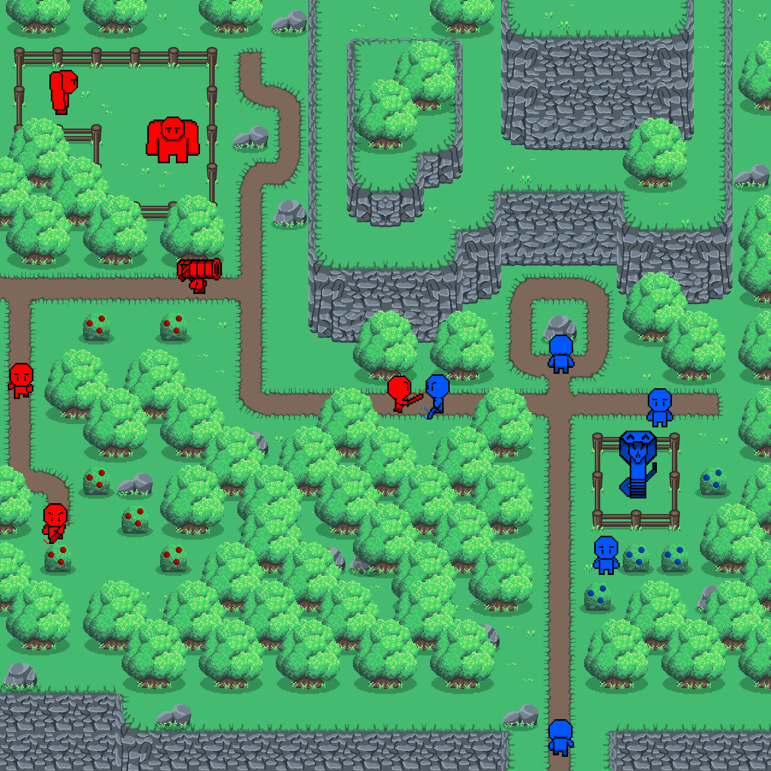
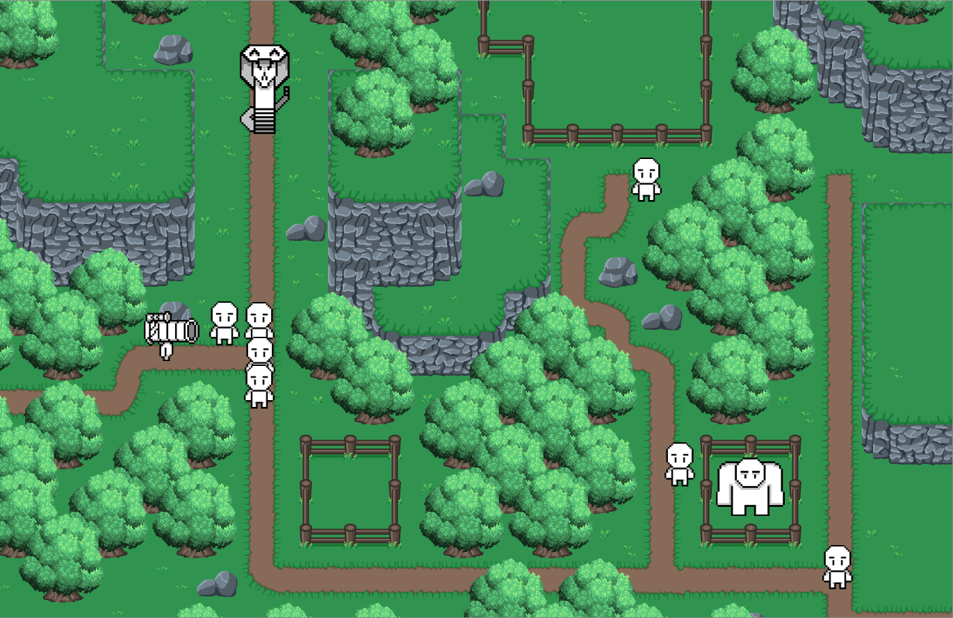
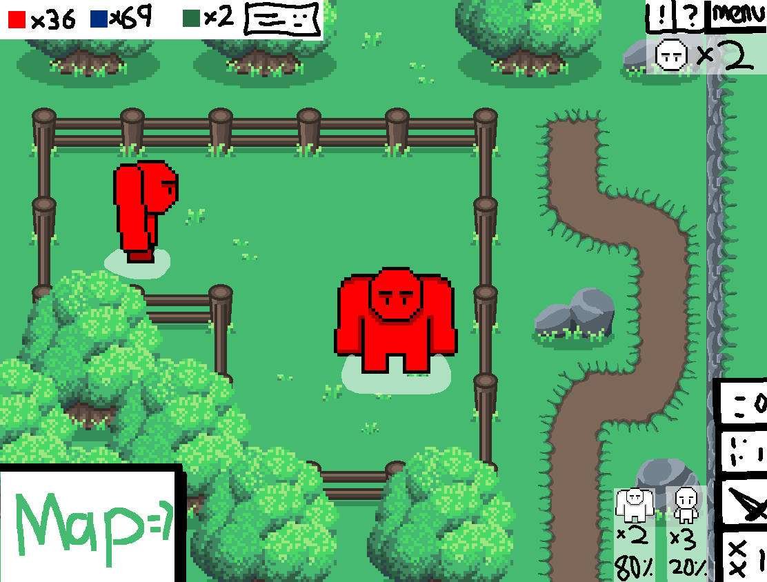
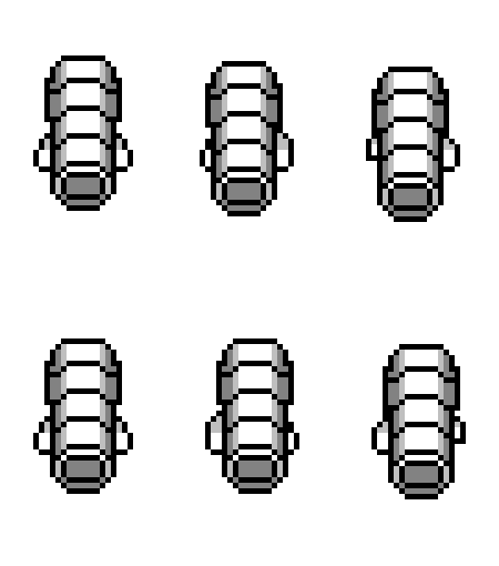
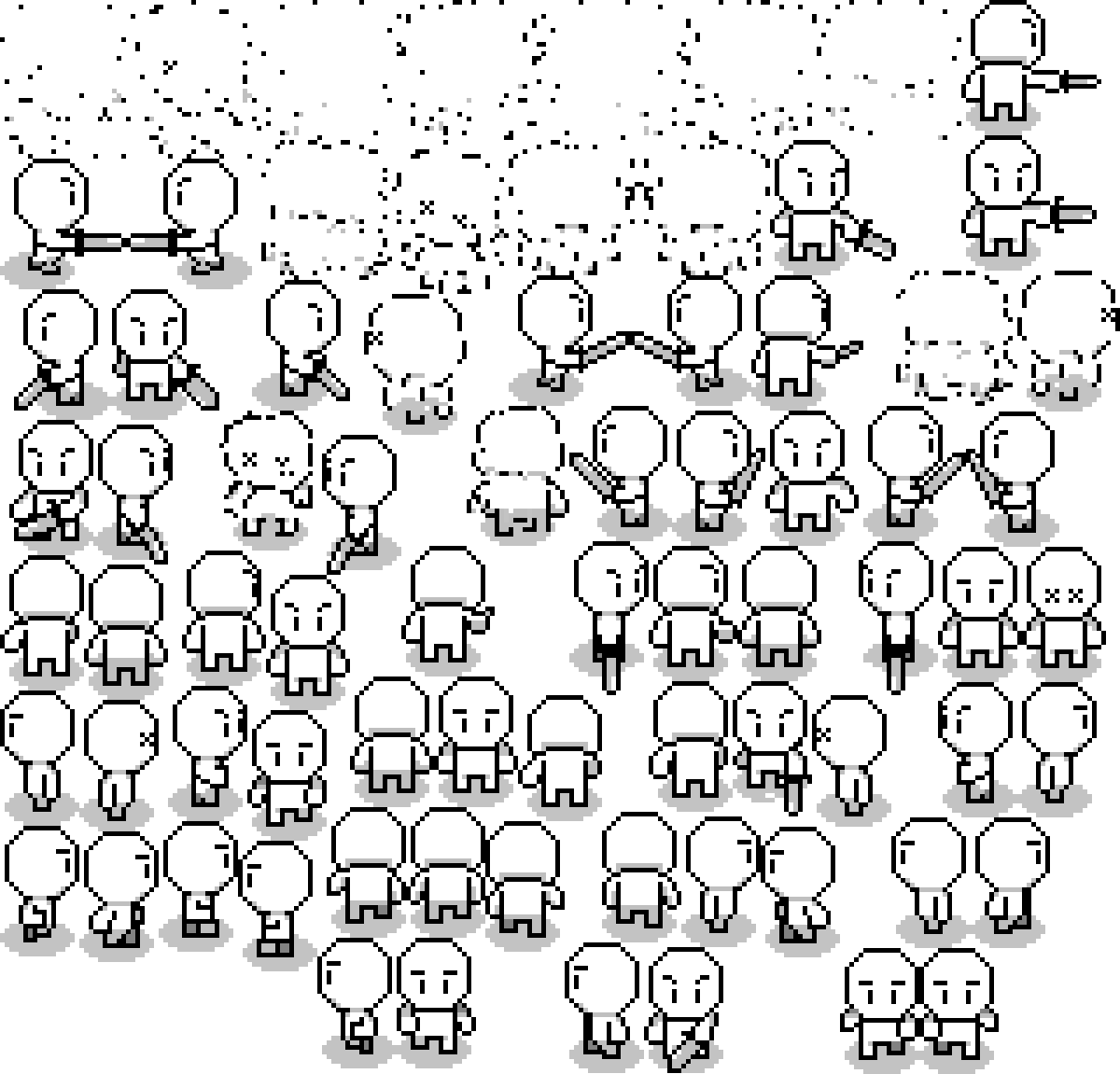
This collection contains a few of the many assets and concept illustrations for a RTS (real time strategy) game I was helping my friends make. Although the working build was
no where close to the concept illustrations I feel they provide a look at what could have been. The featured animations showcase the various units which could have been
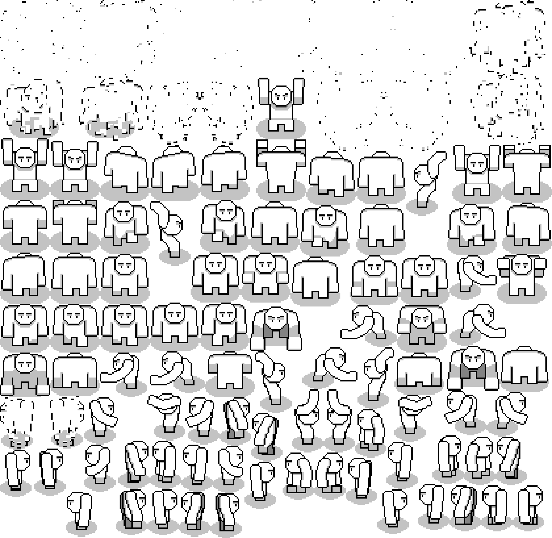
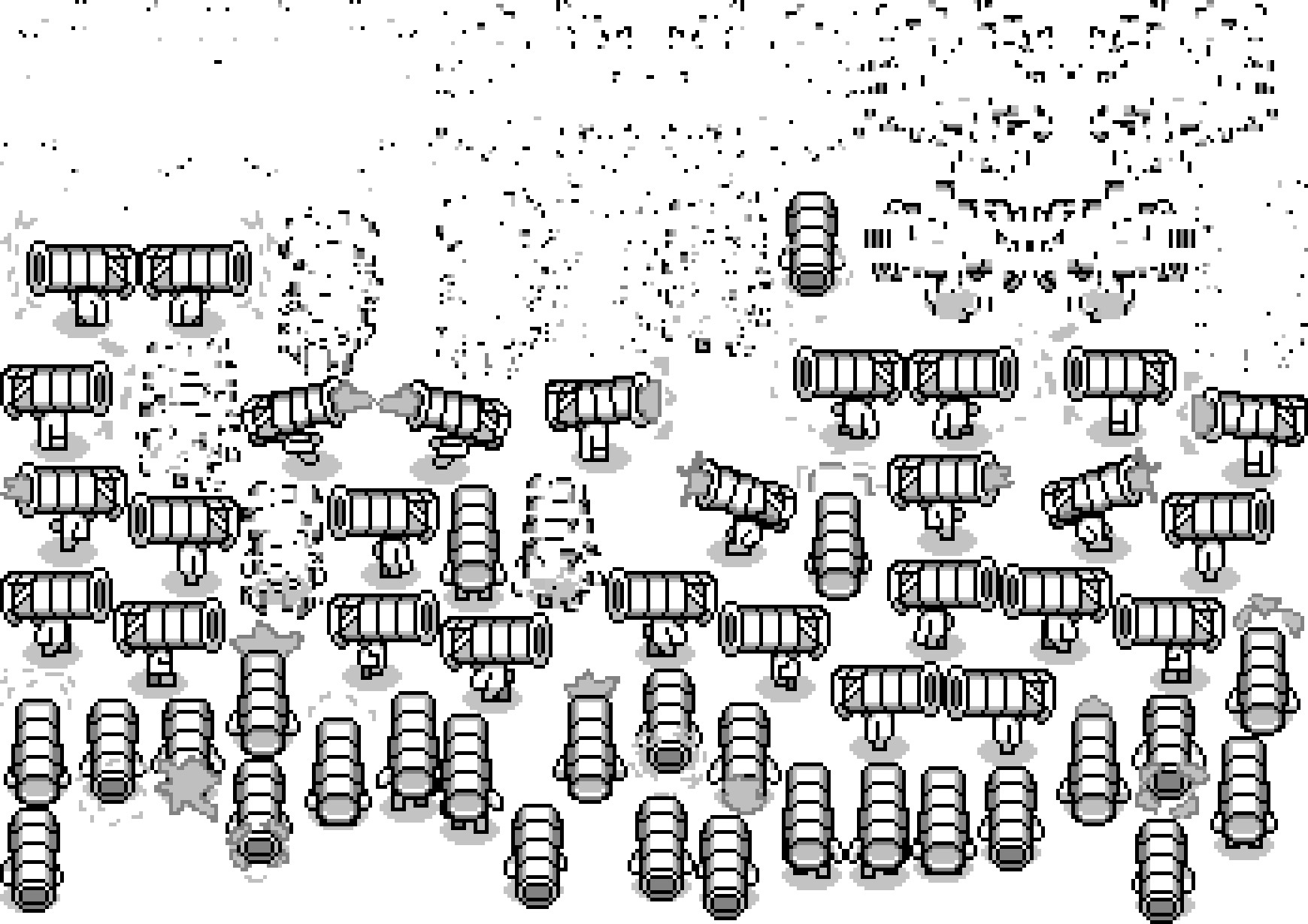
controllable in the game. Additionally the unit's spritesheets are also included. A spritesheet contains all frames from a unit's set of animations. This spritesheet would be read by the program
and translate into an actual in game character.
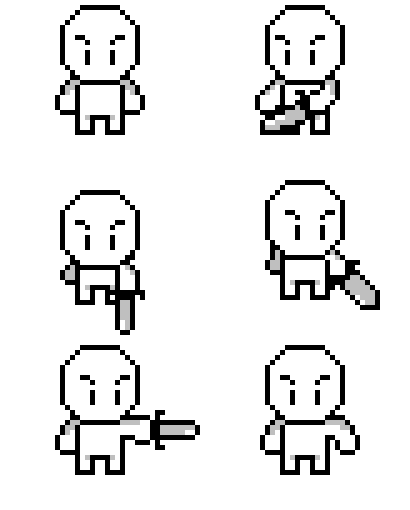
The most basic unit, named "unit1" or "scout", was the only unit which made it into the early versions of the game. In that build the unit was able to move around the
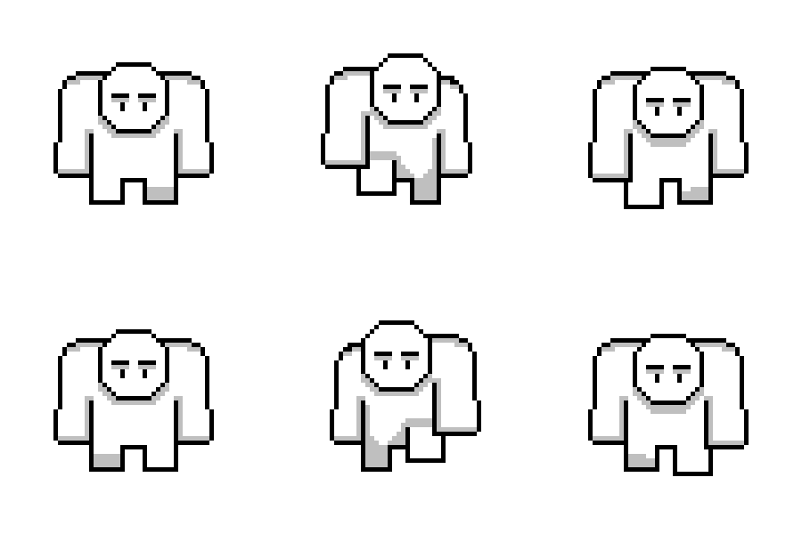
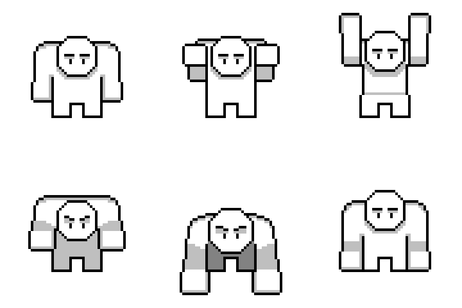
map as well as attack units of an opposing color. The big unit, also know as the "absolute unit", was meant to be a bigger variant of "unit1". In many games you often
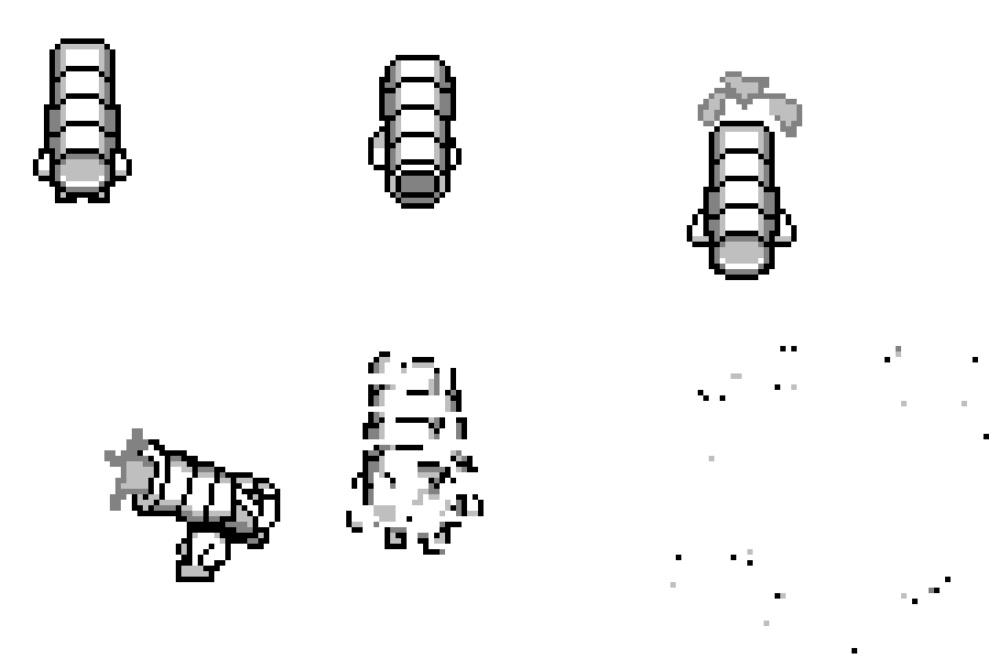
see a larger, more tanky, and more brute like, unit. I think this design captured that idea quite well. The last unit showcased was the "cannonhead". This was one of the many
more imaginative units I came up with. Based off the historical bombard the "Dardanelles Gun", cannonhead may have turned out to be a literal glass cannon or simply a unique
take on an artillery unit. Other designs included a giant snake (visible on the concept illustrations) as well as an exploding trash can (although it was unlikely that this would
have made it in; it never made it off of the concept paper)
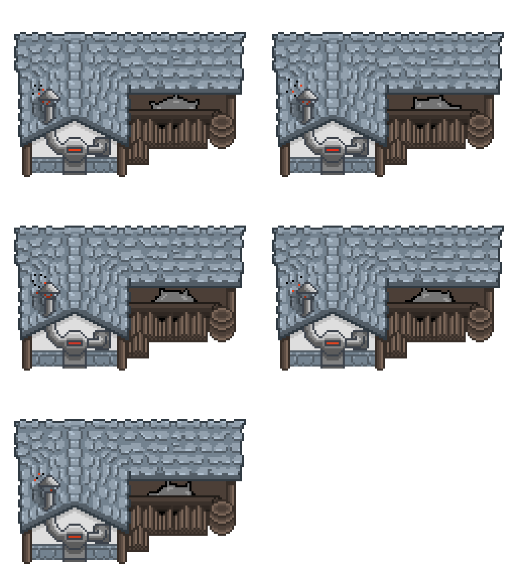
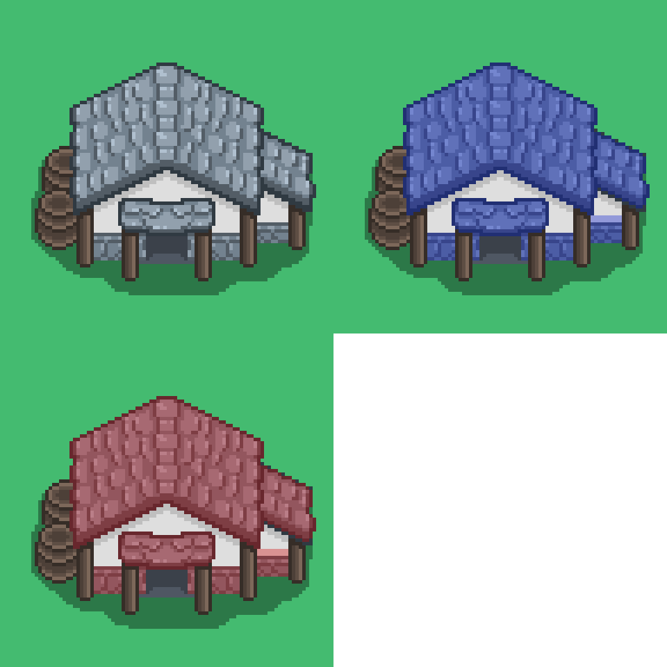
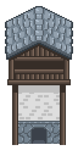
A few buildings including a watchtower, a sawmill, and a generic hut are also displayed. The hut showcases how buildings may
have been colored depending on what color team the player was on. If damaged enough buildings would have exploded in an over-the-top fashion.






Thanks for looking at my artwork :)